How to Use Color Psychology to Create the Perfect Ambiance in Your Home
Colors whisper their own stories in our homes, setting the scene for every room. In your living space, color choices can transform the ambiance—blues evoke serenity; yellows spark vitality. Living rooms serve as cozy retreats and social hubs where aesthetic pleasure meets comfort.
Think of calming blues to wash away stress or elegant grays that pair with bold accents for a touch of sophistication. Warm neutrals invite endless style possibilities while vibrant touches add personality to spaces meant for lively interaction or relaxation at day's end.
Choose Colors for Mood Enhancement
Choosing the right colors for your living space is pivotal, as each hue wields its distinct emotional influence. For instance, calming blues—think soft powder blue or seafoam green—are ideal in a bustling living room to foster tranquility and relaxation. Elegant grays provide sophistication; painting a fireplace with chic gray tones injects modernity while maintaining warmth during social gatherings.
In contrast, warm neutrals like beige and taupe create inviting backdrops that complement various decor styles seamlessly. They exude an understated class essential for any communal area of repose or casual entertainment. However, it's vibrant accents that truly animate these spaces: bursts of color introduced through artwork or decorative objects invigorate with refreshing vitality—a crucial element in areas designated for daytime activity and social interaction.
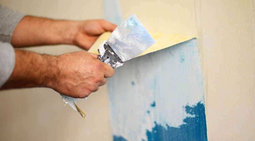
For optimal mood enhancement within your home, consulting professionals can be key. It is recommended to reach out to interior house painters who can bring invaluable expertise to achieving the desired ambiance using paint alone!
Consider Room Function and Tone
To create an ideal ambiance, it's essential to consider a room's function and the feeling you wish to evoke. A bedroom should promote tranquility for restful sleep; thus, soft hues that calm are appropriate. Contrastingly, spaces meant for entertainment—like game rooms or man caves—benefit from energetic colors that incite excitement.
In choosing color schemes, one must also account for architectural style and lighting levels. Modern homes can carry bolder shades with trendy decor accents, while traditional settings call for muted tones complemented by classic furniture pieces. Designers recommend blending varying hues of a chosen color rather than monochromatic arrangements—one bright favorite paired with its darker and lighter kin creates depth without overwhelming uniformity in design.
Use light-reflective pale tints in sun-filled areas or absorbent dark palettes where coziness is desired. Remember: textures matter as much as the palette—the interplay between different materials enhances visual interest beyond mere paint applications. Incorporate accessories like cushions or rugs in accentuating tones to uplift any space instantly without permanent changes—a strategic approach recommended by experts aiming at balanced yet dynamic interiors.
Harmonize Hues with Lighting Choices
Lighting plays a pivotal role in harmonizing hues within your home, influencing not only color perception but also the atmosphere of each room. Green's soothing qualities shine with soft ambient lighting, perfect for bedrooms or offices. Yellow invokes happiness, working best with moderate illumination in living spaces.
Dimmer options allow flexibility—bright for kitchens, toned down for calm retreats. Pink's tenderness and brown's comfort come alive with gentle light. Gray requires careful lighting to avoid depressive moods while emphasizing sophistication.
Al's Quality Painting expertly applies color psychology, using quality paint to evoke specific moods, whether tranquility with soft blues or energy with vibrant yellows.
Related Content


COMMERCIAL CLIENTS TESTIMONIALS
RESIDENTIAL PAINTING REVIEWS
We Use Only the Best Painting Products


1213 Allea Lane Vista CA 92083
760-535-5697 call or text
License #699636
Fully insured with Workers Compensation